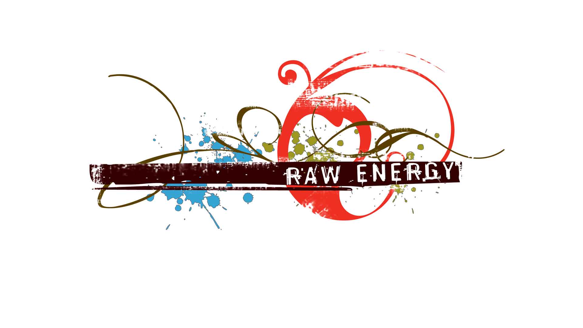
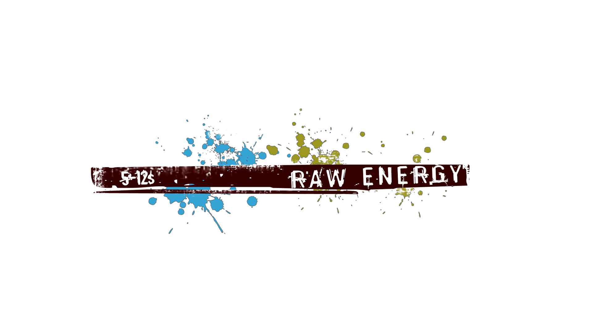
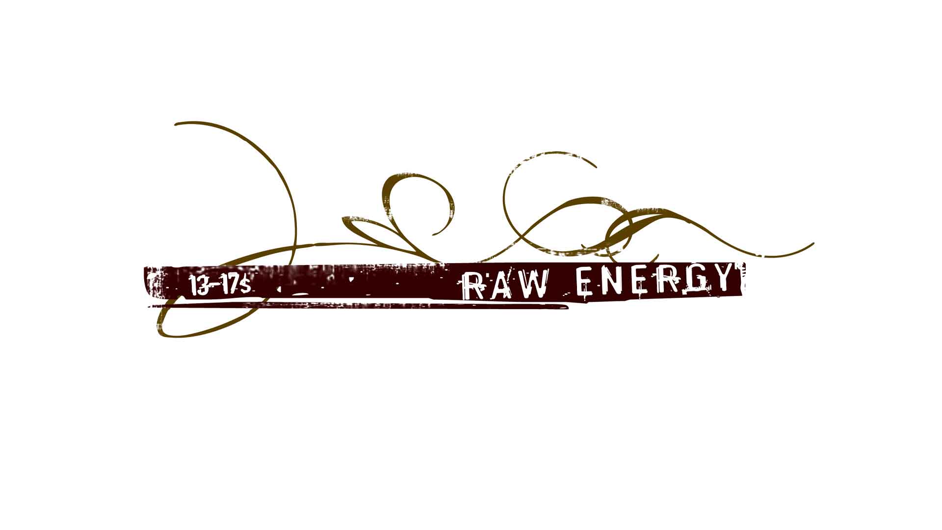
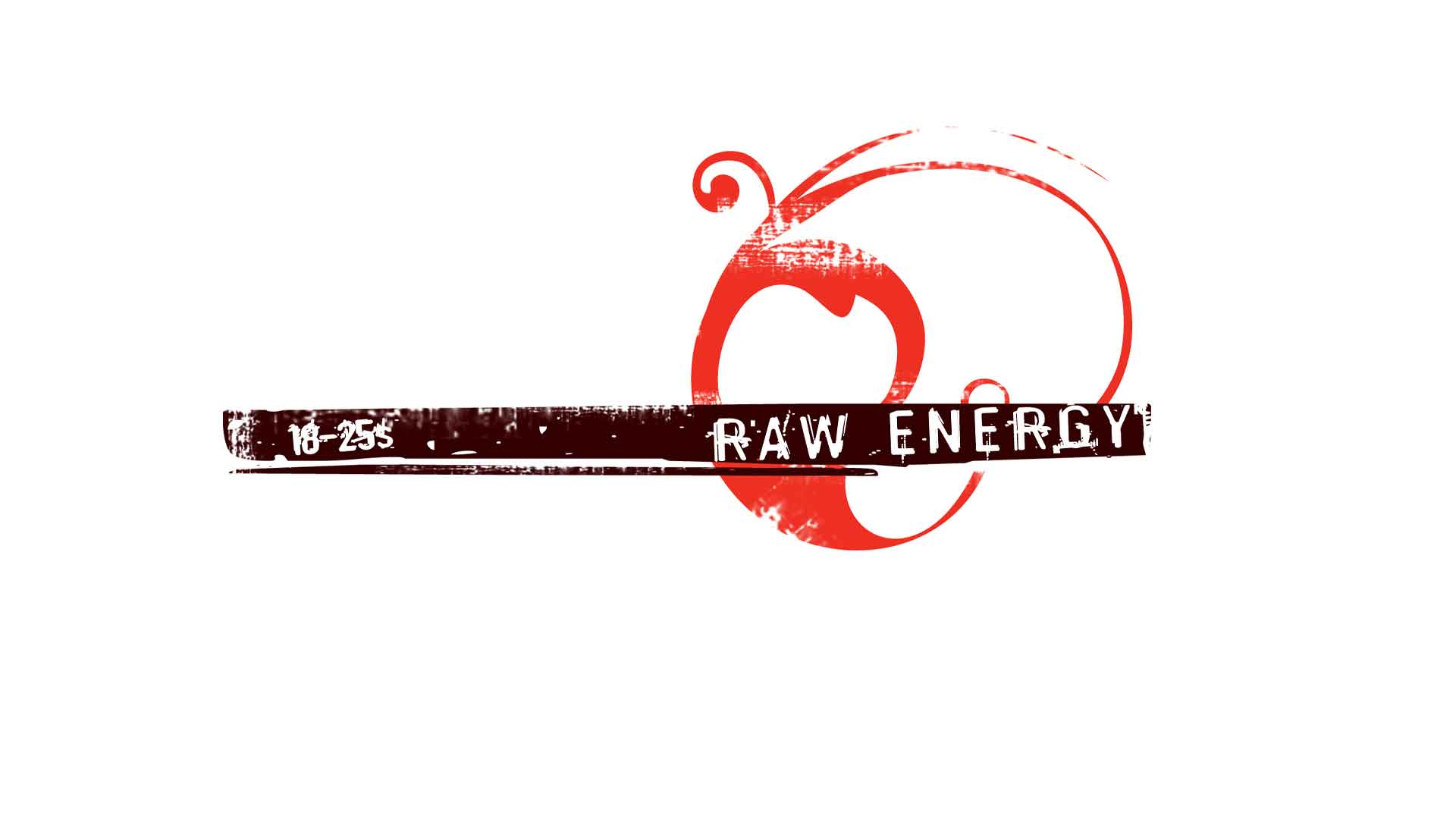
Raw Energy, a community group being part of Athelstone Uniting Church, wanted a logo that embraced the different demographics of their services, so I experimented with objects that represented the types of ideologies associated with the groups: the 5-12 age group have dots that represent playfulness; the 13-17 have curly lines which represent personal presentation and figuring out your own identity, and; the 18-25 group have a circle-like shape which represents moving into a greater understanding of your role in the world and how you fit with a work-life balance. Although each group has a different element, the individual group of logos combine to make the Energy Raw logo work together and was used across all of their marketing collateral. I’m stacks happy with the result – it is symbolic and seems to be timeless of the characteristics of the different age bracket groups.


