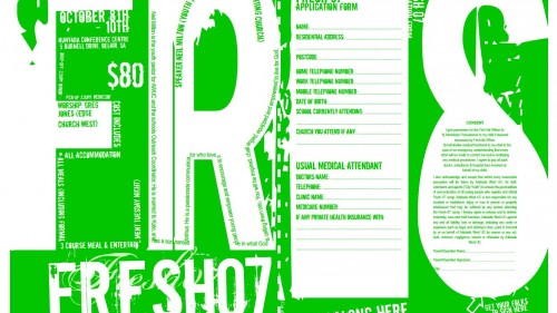
Another event put on by City Youth Church, I took the “No Standing” sign approach – something most people who were sending their kids to would know the look of (so the secondary audience or decision makers), and put the typography in a hip street way so that youth could relate to it. I also made the best use of the printing space by adding small flyers to the bottom of the SRA3 paper, that way we could save money, have extra marketing material, and get the most out of the marketing campaign budget.


